information graphic-folio
projects can be organized into several different diagrams
based on many different categories including
-process
-type of design
-favorites
-subject matter
-typeface
-color palette
-amount of sleep received during the course of project.
make your own project
main page would contain lists of categories or adjectives describing different aspects of each project. dragging and combining certain words in the center generates projects that match the created description.
planet Nitsch
a core to exosphere diagram showing projects appropriately existing at different layers. traveling deeper reveals what projects are most meaningful to me; branding=crust, palimpsest=core.
rummage
main page contains a messy pile of pieces and components from different projects, not crops or thumbnails, but individual pieces pulled and divorced from their context. clicking on a disjointed piece would clear away junk from other projects and fill the screen with a complete project.
time cube
projects are paged through in a linear horizontal sequence. At any one project the page can be rotated to another dimension of that project to reveal it at a different stage of it's process.
Tuesday, November 25, 2008
Thursday, September 11, 2008
Thursday, September 4, 2008
Tuesday, September 2, 2008
Newsletter Layouts
Direction 1:
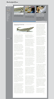
 Keeping with a spare and subdued layout and color pallet, I organized content giving the user three articles that appeal to their interests. I decided to give a decent amount of the article in the newsletter, before giving a read more option.
Direction 2:
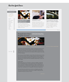
 Here I decide to list the relevant articles in a horizontal format, and give the entire article below, this appeals to my audiences appreciation of heavy amounts of content. I also changed colors slightly, wondering if the use of green and the white background might come off as too hip or modern for my audience.

Direction 3:

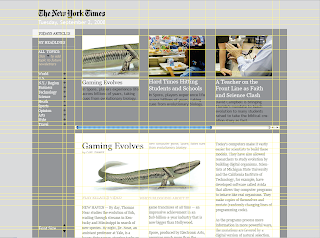
Here I took a much more simple approach which appeals to my audiences appreciation for video content. This content is somewhat long and could not at all be considered "soundbite." The option to go strait to the article comes ahead of the video, in case they want to proceed to what they may consider more rich form of content.
 Keeping with a spare and subdued layout and color pallet, I organized content giving the user three articles that appeal to their interests. I decided to give a decent amount of the article in the newsletter, before giving a read more option.
Direction 2:
 Here I decide to list the relevant articles in a horizontal format, and give the entire article below, this appeals to my audiences appreciation of heavy amounts of content. I also changed colors slightly, wondering if the use of green and the white background might come off as too hip or modern for my audience.
Direction 3:

Here I took a much more simple approach which appeals to my audiences appreciation for video content. This content is somewhat long and could not at all be considered "soundbite." The option to go strait to the article comes ahead of the video, in case they want to proceed to what they may consider more rich form of content.
Monday, September 1, 2008
Project 1: Audience
Baby Boomers— Atheist/Agnostic —Teachers
Being teachers, these baby boomers are likely to be the first college graduates in their family, and generally feel as though they have transcended the unreason that governed the lives of their parents. This does not necessarily mean that they view their upbringing with disdain, but merely that their present leanings toward empiricism were not there from the start; in short, they were raised religious.
This perceived rise from ignorance gives them an acutely independent personality, along with a good deal of cynicism and skepticism.
This audience may either read or be Richard Dawkins

Whether active or passive in their opposition to religion, all members of this group view it as manipulative, and are on the look out for manipulation in everything.
They are constantly bombarded by marketing like this…
and even this...
And would most likely appreciate the makers of this remix video.
This barrage of advertising, along with their already deeply held skepticism, has an effect on how they view graphic design.
This group is hyper-aware of manipulation, and may feel that anything too flashy, expressive, or illustrative is attempting to work them over. This may result in their design tastes being rather conservative and subdued, expressing a more direct, trustworthy, no-bullsh*t feeling.
Ex: graphics like these probably won’t appeal to this group (note: you only need to watch the first few seconds)
While other Boomers may spend more time online doing hobby or entertainment oriented tasks, these Boomers have the unique responsibility of shaping minds, and use the internet as their main research tool. They often get their news and information from articles and blogs and consider themselves web and tech-savvy.
They absolutely loathe oversimplification and “sound bite” modes of communication. They appreciate a topic discussed at length, and don’t mind doing a lot of reading.
Being teachers, these baby boomers are likely to be the first college graduates in their family, and generally feel as though they have transcended the unreason that governed the lives of their parents. This does not necessarily mean that they view their upbringing with disdain, but merely that their present leanings toward empiricism were not there from the start; in short, they were raised religious.
This perceived rise from ignorance gives them an acutely independent personality, along with a good deal of cynicism and skepticism.
This audience may either read or be Richard Dawkins

Whether active or passive in their opposition to religion, all members of this group view it as manipulative, and are on the look out for manipulation in everything.
They are constantly bombarded by marketing like this…
and even this...
And would most likely appreciate the makers of this remix video.
This barrage of advertising, along with their already deeply held skepticism, has an effect on how they view graphic design.
This group is hyper-aware of manipulation, and may feel that anything too flashy, expressive, or illustrative is attempting to work them over. This may result in their design tastes being rather conservative and subdued, expressing a more direct, trustworthy, no-bullsh*t feeling.
Ex: graphics like these probably won’t appeal to this group (note: you only need to watch the first few seconds)
While other Boomers may spend more time online doing hobby or entertainment oriented tasks, these Boomers have the unique responsibility of shaping minds, and use the internet as their main research tool. They often get their news and information from articles and blogs and consider themselves web and tech-savvy.
They absolutely loathe oversimplification and “sound bite” modes of communication. They appreciate a topic discussed at length, and don’t mind doing a lot of reading.
Additional...
This group may be wary of graphic design in general, especially when it comes to their news and information. One would assume that a likely design direction for this group would be clean, spare, minimal. But this group will be constantly scrutinizing the content and the visual delivery of that content; too spare and minimal, and the audience may not trust the delivery, and surmise a level of unprofessionalism, amateurishness, and ultimately unreliability.
Subscribe to:
Posts (Atom)


